Brand/ Client Name:
Fairleigh Dickinson University
Fairleigh Dickinson University is a private institution recognized for academic excellence and a vibrant campus community.
This project features visual designs for art exhibitions and university communications, including posters, food menus, brochures, signage, press materials, and a website redesign concept. Each piece aligns with the university’s identity while adapting to distinct exhibition and event themes across print and digital platforms.
Food Menu
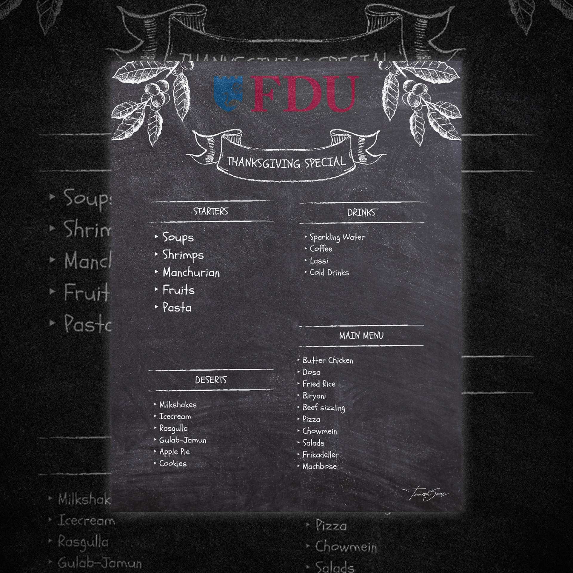
With soups, shrimps, butter chicken, fried rice, rasgulla, and apple pie, this menu highlights the university’s inclusive and multicultural spirit during a seasonal celebration. The chalkboard inspired theme creates a warm, welcoming tone aligned with campus festivities.
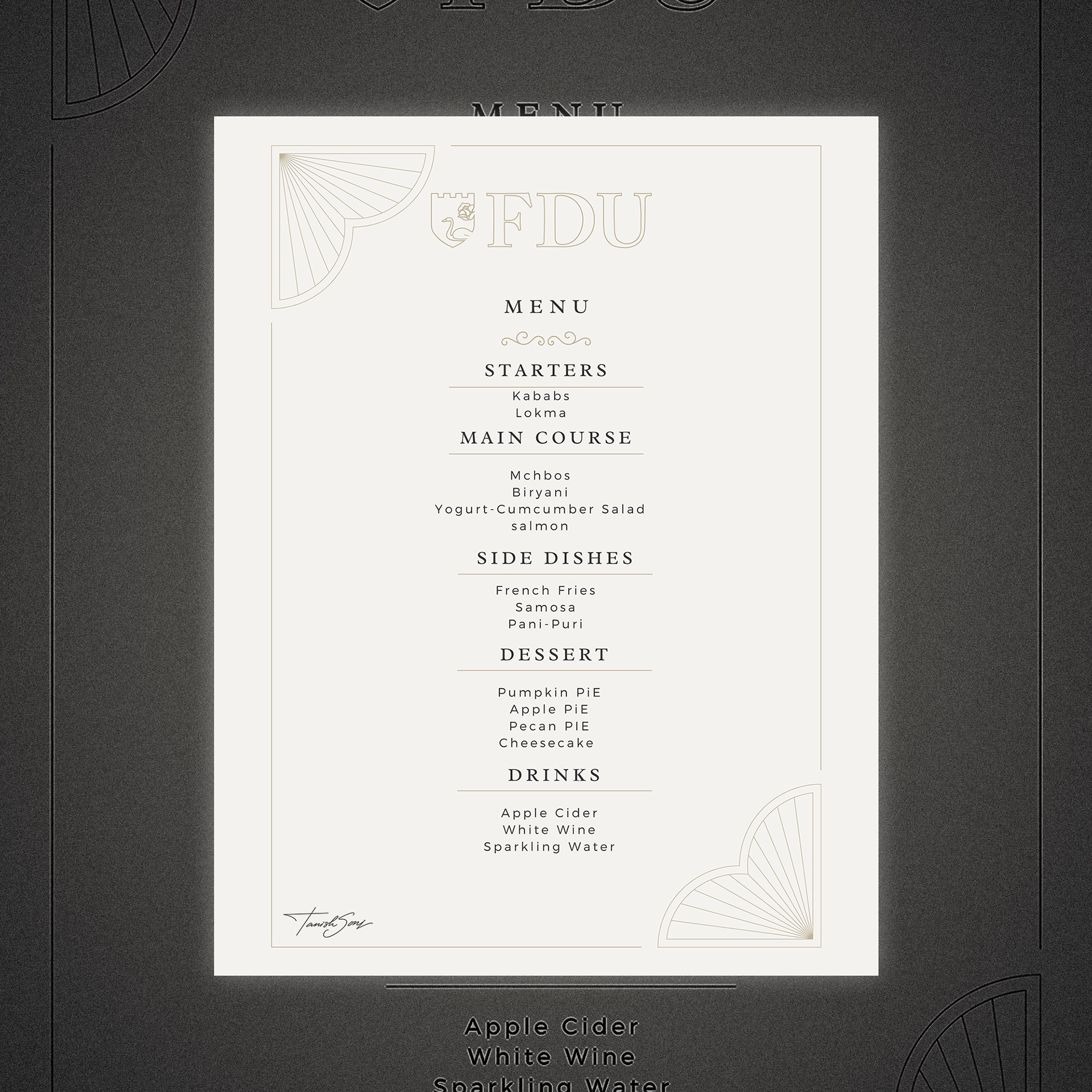
Featuring kababs, biryani, yogurt cucumber salad, and salmon, this menu reflects the university’s diverse and global community. The refined layout and understated palette support a formal campus gathering while presenting the courses with clarity and elegance.
Signage
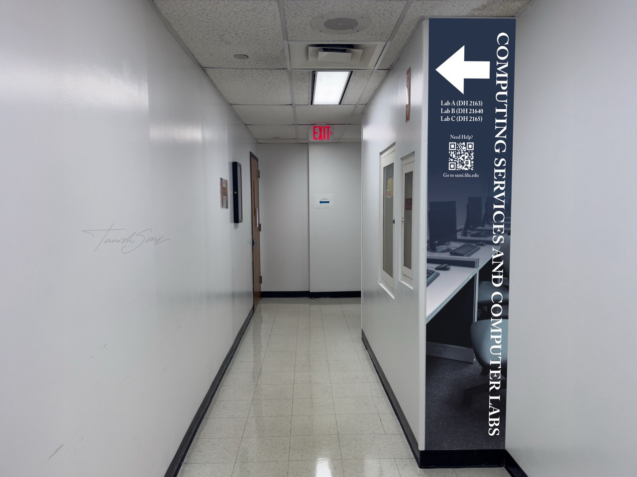
The photograph shows the graphic installed within the campus hallway, guiding students toward the computing labs.
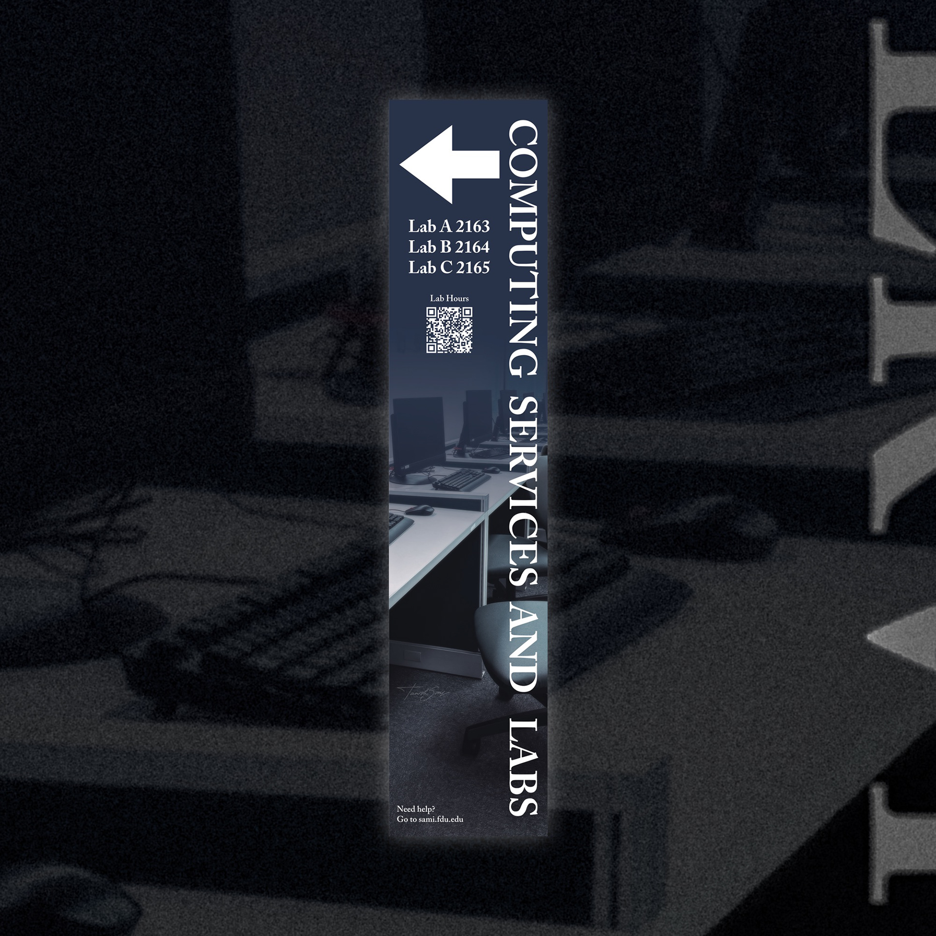
Designed to guide students to the computing labs, this directional graphic combines a bold arrow, vertical typography, and clear lab numbers for instant clarity. A QR code provides quick access to lab hours, while the layout ensures high visibility within a narrow corridor.
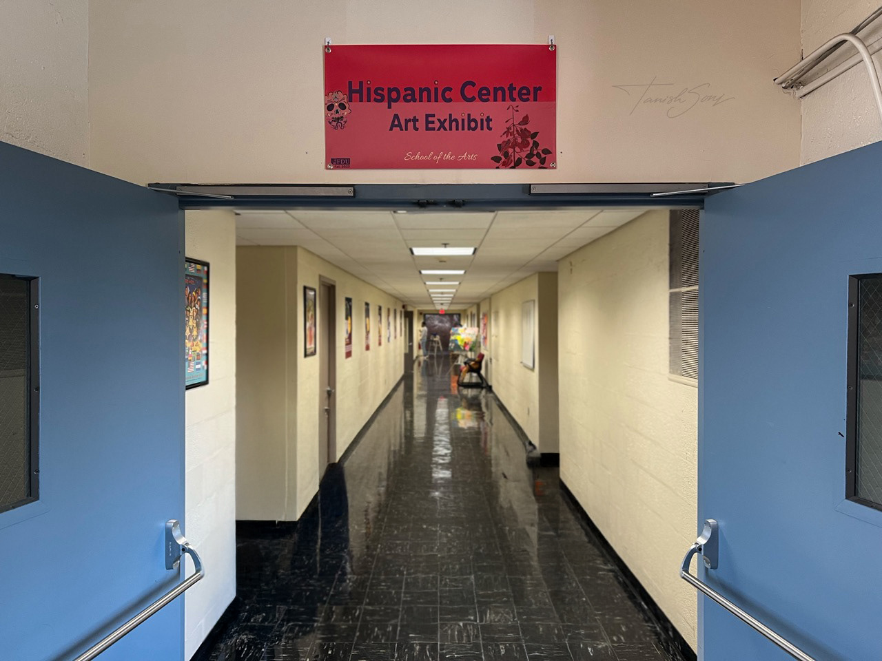
The photograph shows the signage installed at the exhibition entrance within the campus hallway.
Designed to establish a clear identity for the Hispanic Center Art Exhibit, this signage uses bold typography, rich red tones, and cultural motifs to create strong visual presence. The layout ensures visibility at a distance while seamlessly aligning with the university’s brand.
Exhibition Advertising Collateral
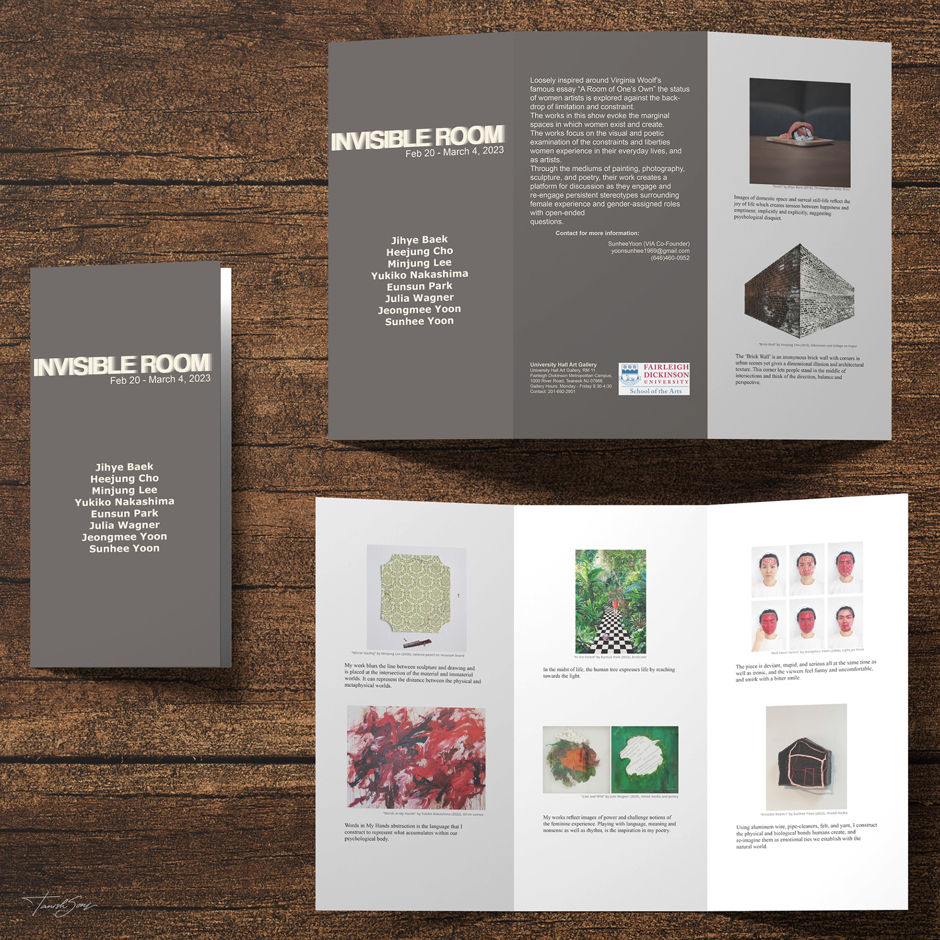
Invisible Room Brochure
This brochure extends the visual identity of Invisible Room into a clean, editorial format. A muted palette and restrained typography create a contemplative tone, while a balanced layout of imagery, text, and white space ensures clarity and focus throughout.
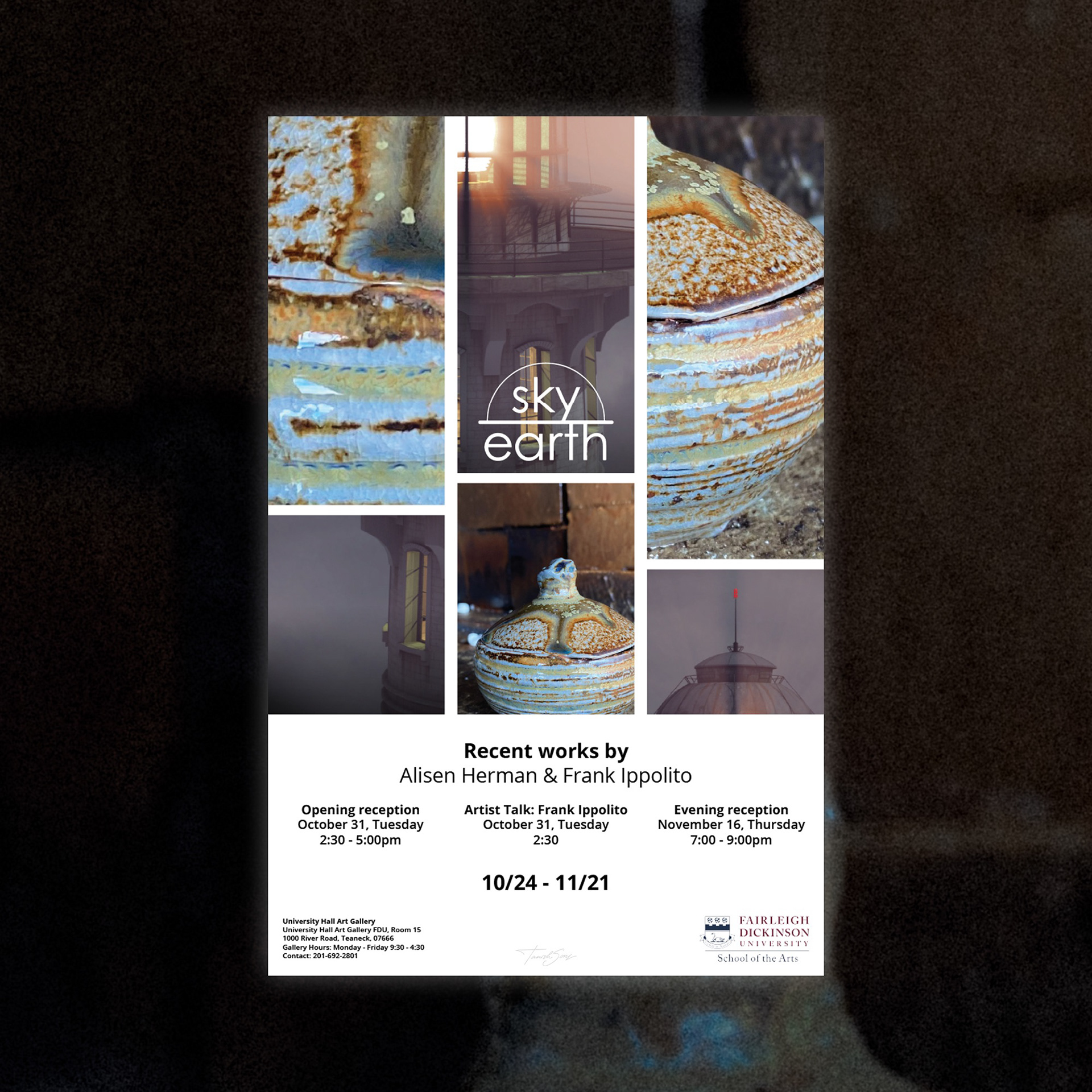
Sky / Earth Poster
Designed to express the dialogue between sky and earth, this poster uses a structured grid and layered imagery to create depth with clarity. Minimal, centered typography lets the artwork lead while presenting details with precision, resulting in a refined and contemporary promotional piece.
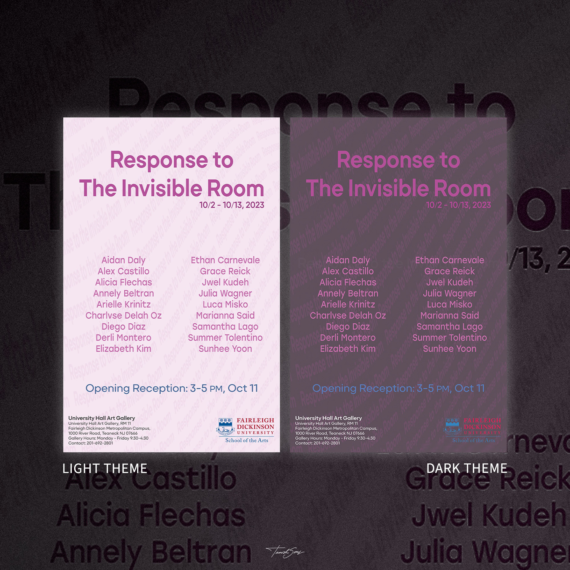
Response to The Invisible Room Poster
This exhibition advertising poster explores light and dark theme variations within a consistent typographic structure. Bold, centered headlines and a clean artist listing ensure clarity, while a subtle patterned background adds depth without distraction.
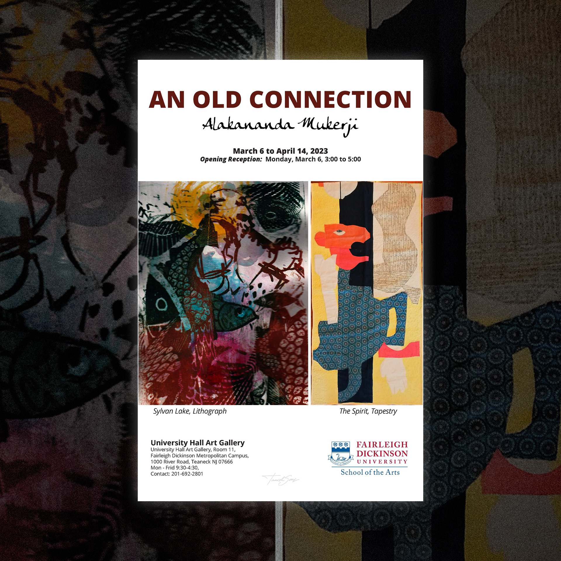
An Old Connection Exhibition Poster
This exhibition poster pairs bold typography with two contrasting artworks to highlight material and narrative depth. A structured layout ensures clarity, while generous spacing allows the work to lead. The result feels refined, balanced, and institutionally grounded.
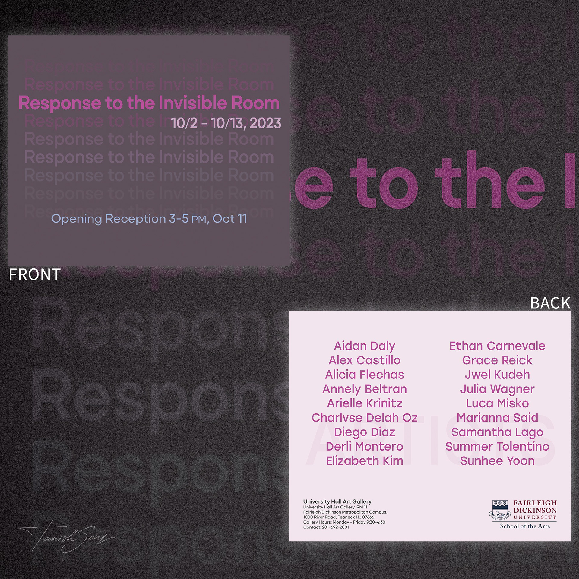
Response to The Invisible Room Postcard
This postcard translates the exhibition identity into a compact format. Layered typography on the front builds visual depth, while the back presents artist names with clean hierarchy. The design remains bold, minimal, and instantly recognizable.
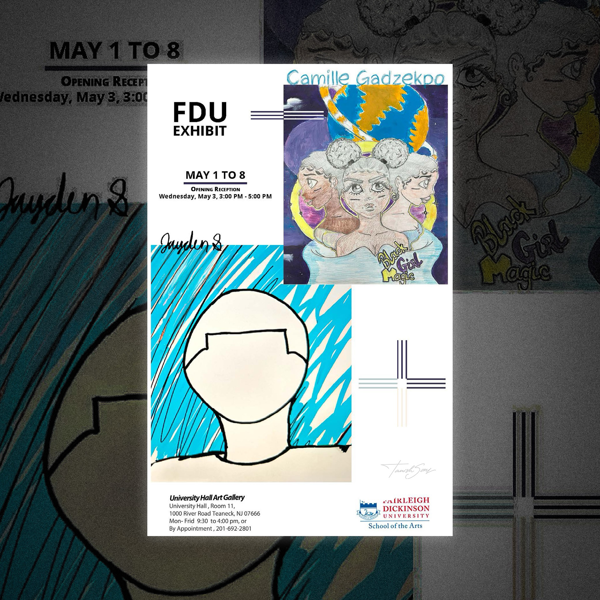
FDU Student Exhibition Poster
This poster combines the work of two student artists within a balanced, modular layout. Their artworks are layered thoughtfully, using negative space to maintain clarity while allowing each visual style to stand out with equal presence.
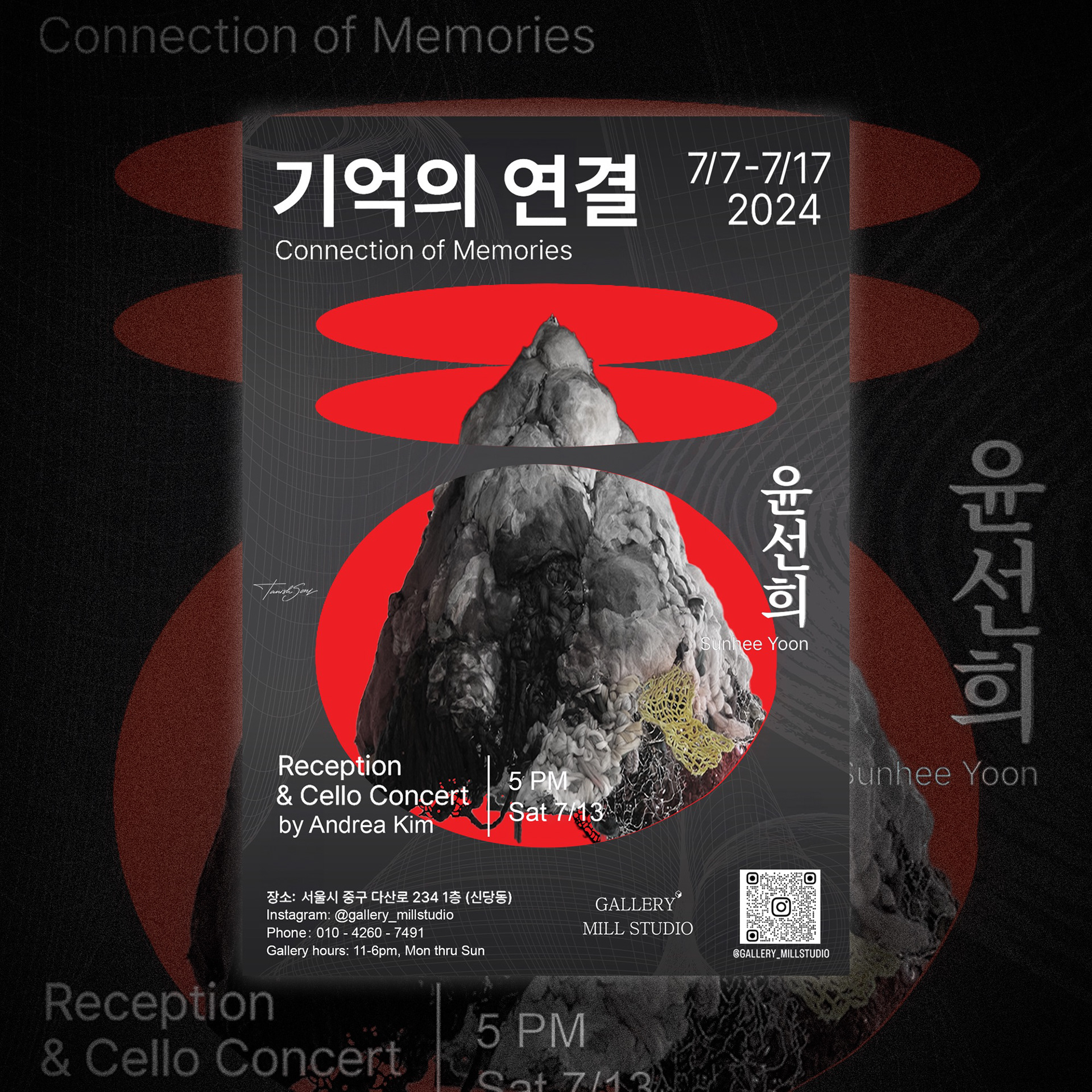
Connection of Memories Poster
This poster layers bold red forms with sculptural imagery to create strong visual impact. Bilingual typography and structured details maintain clarity, balancing cultural identity, contemporary form, and event information within a striking, modern composition.
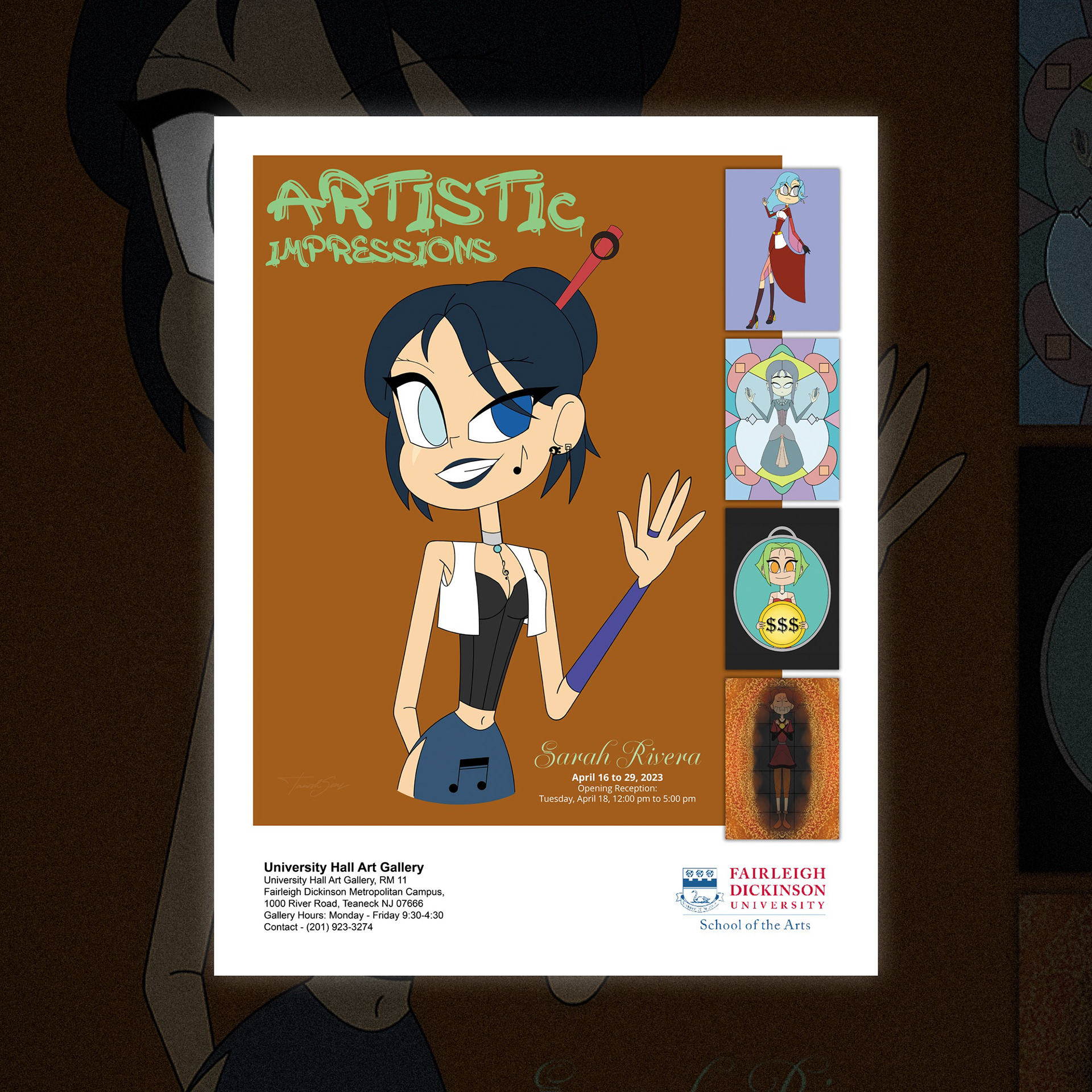
Artistic Impressions Poster
This poster features Sarah’s illustrated character as the focal point, reflecting her playful visual style. Additional works are displayed vertically to attract attention while keeping the layout simple, clean, and aligned with her artistic voice.
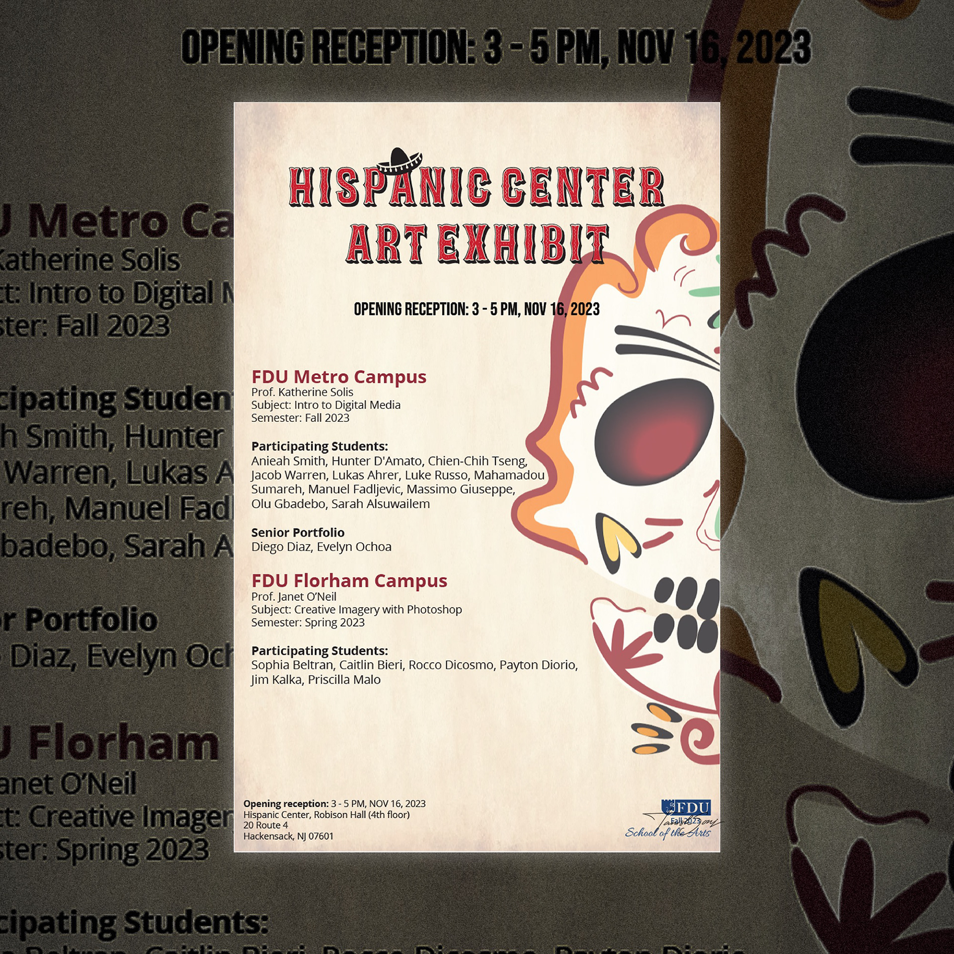
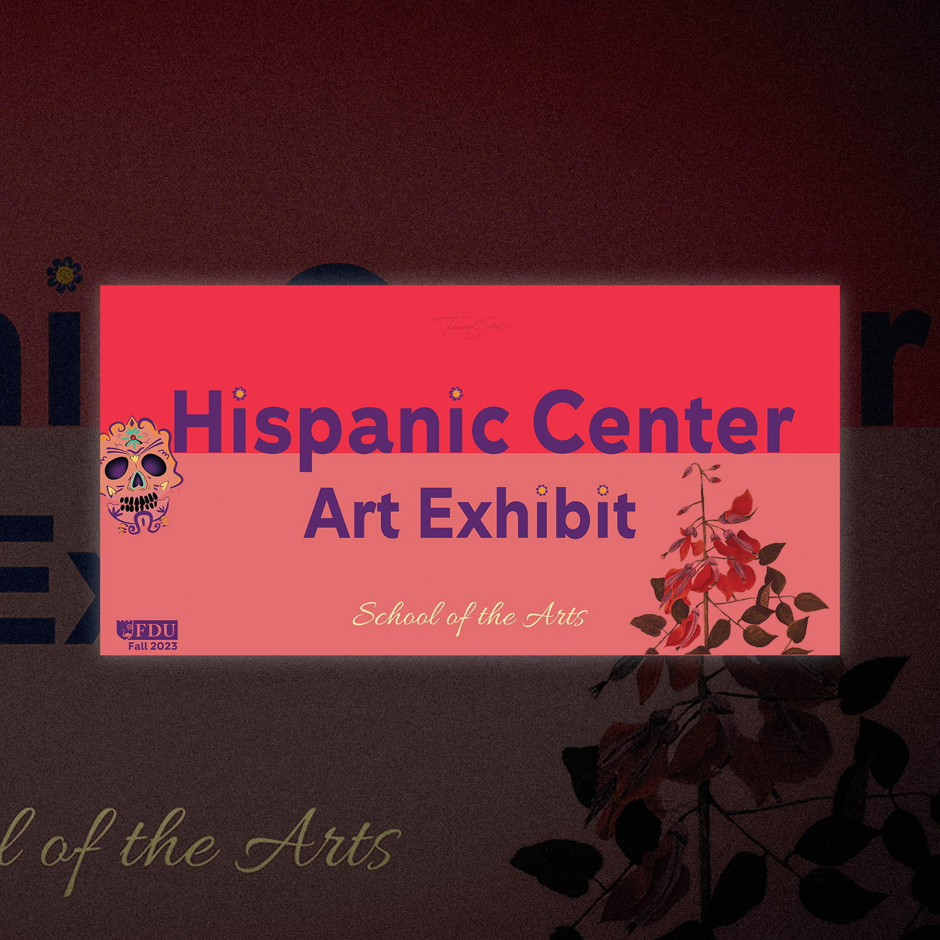
Hispanic Center Art Exhibit Poster
This poster incorporates cultural symbols such as the decorative skull, sombrero, warm red tones, and textured background to reflect Hispanic heritage and celebration. These elements create authenticity and visual energy while grounding the exhibition within its cultural context.
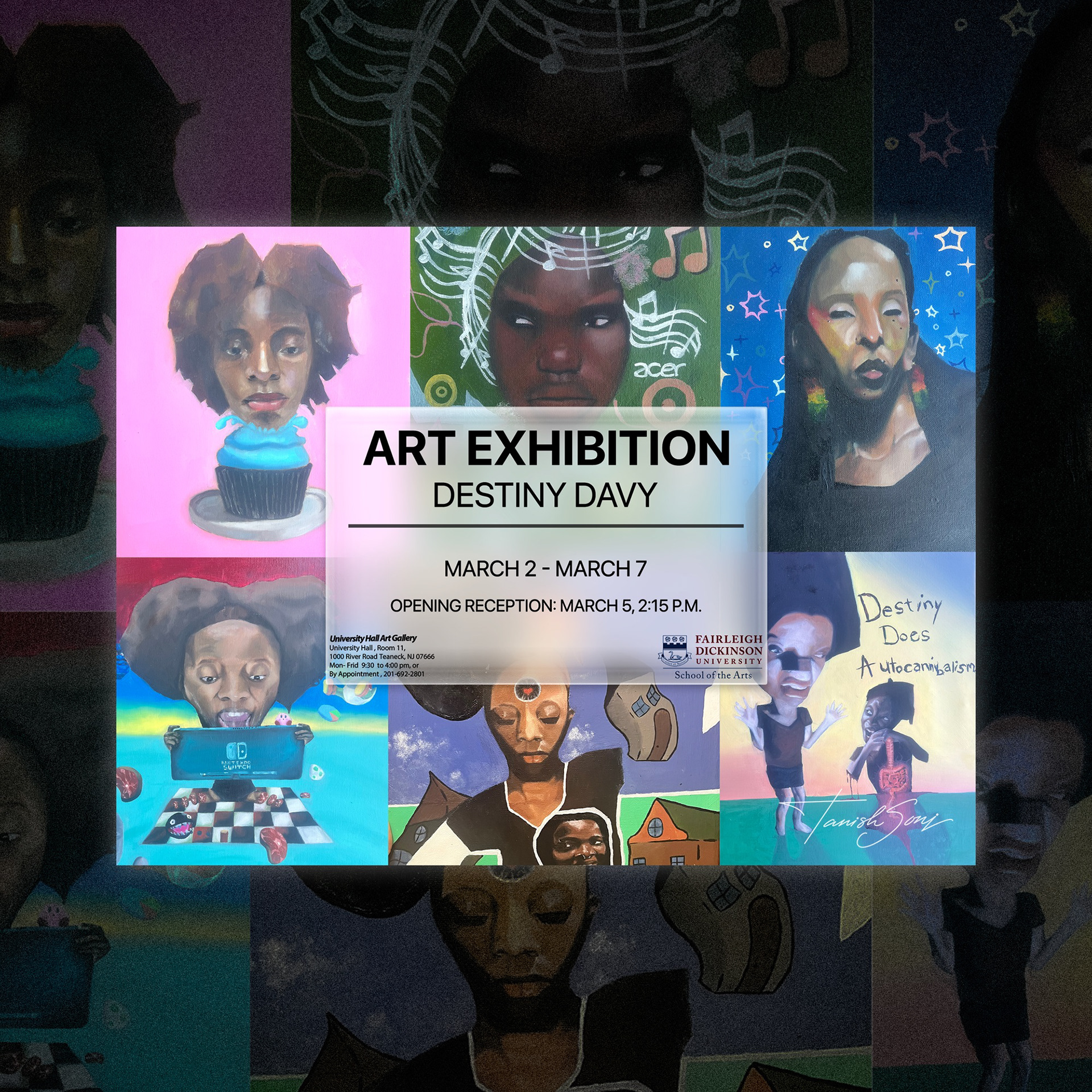
Destiny Davy Art Exhibition Poster
A grid of expressive portraits reflects personal identity and layered storytelling. The central translucent panel organizes key details, balancing bold color contrasts with structured typography to maintain clarity within a dynamic visual field.
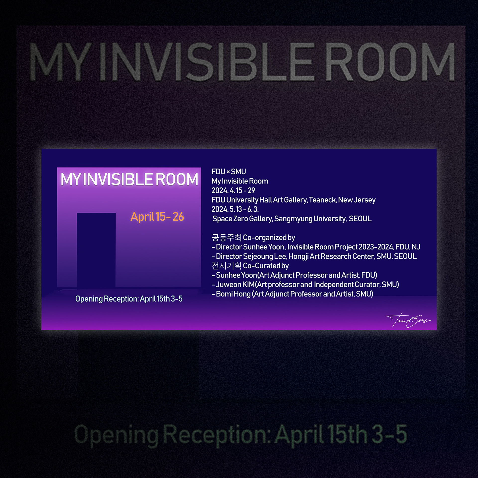
My Invisible Room Opening Poster
A minimal doorway form anchors the composition, symbolizing entry into unseen narratives. The purple gradient creates depth and atmosphere, while structured typography organizes detailed information with clarity and balance.
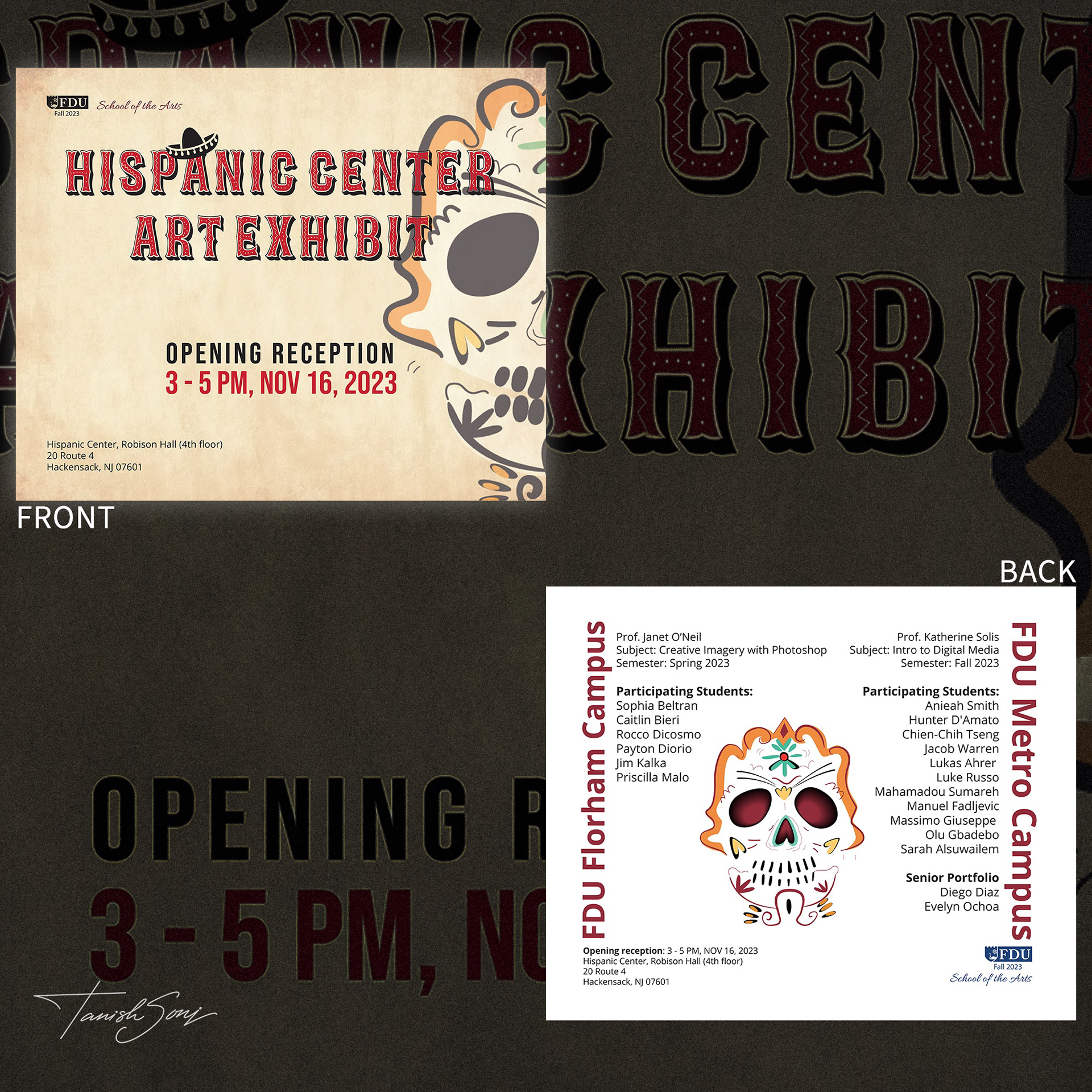
Hispanic Center Art Exhibit Postcard
The illustrated skull references Día de los Muertos, symbolizing remembrance and cultural pride. Warm tones and textured background evoke tradition, while the clean layout ensures event details remain clear and accessible.
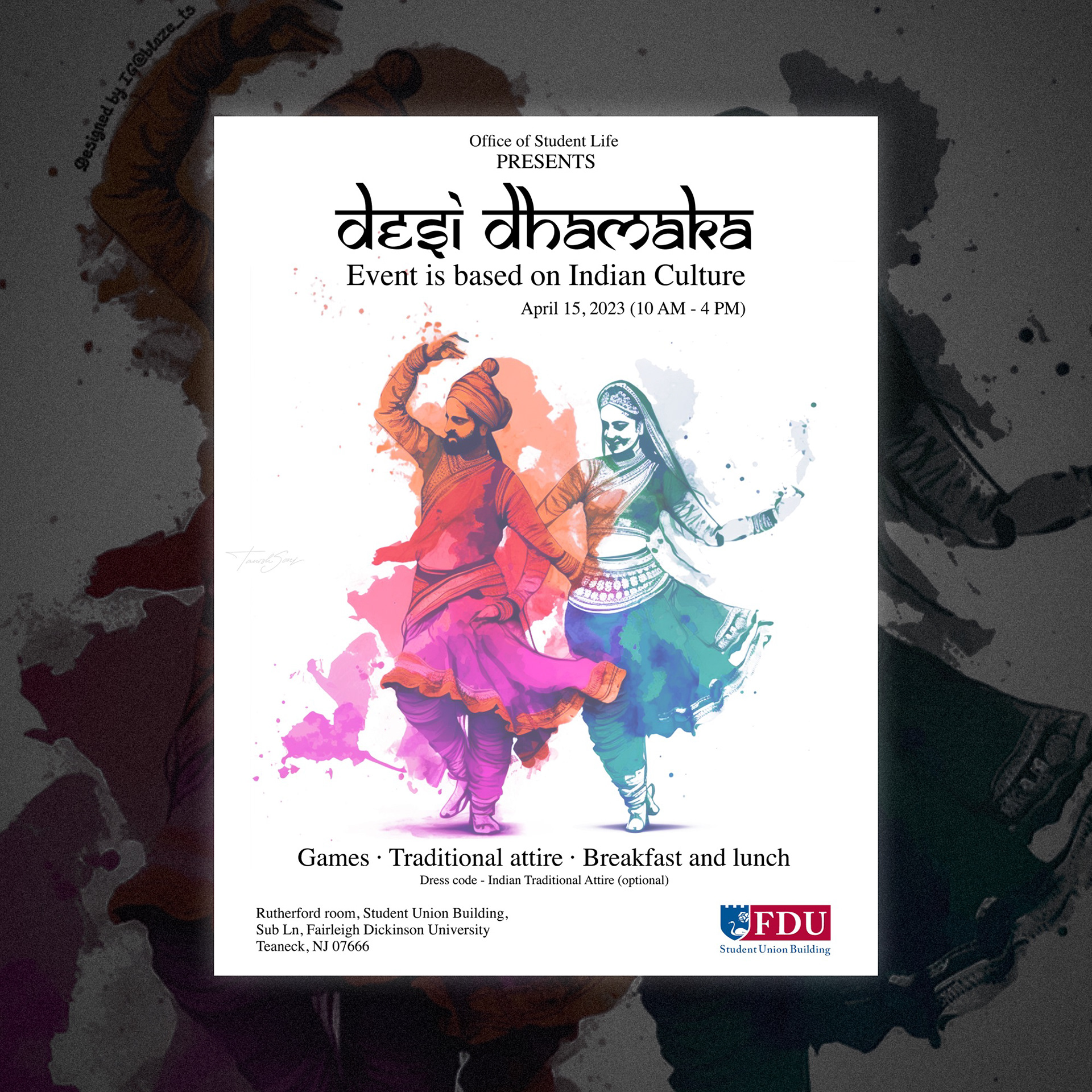
Desi Dhamaka Event Poster
This poster captures the energy of Indian culture through expressive dance figures and vibrant watercolor splashes. Traditional attire and dynamic movement celebrate heritage, while clean typography and open space keep the layout modern and inviting.
Website UI Redesign
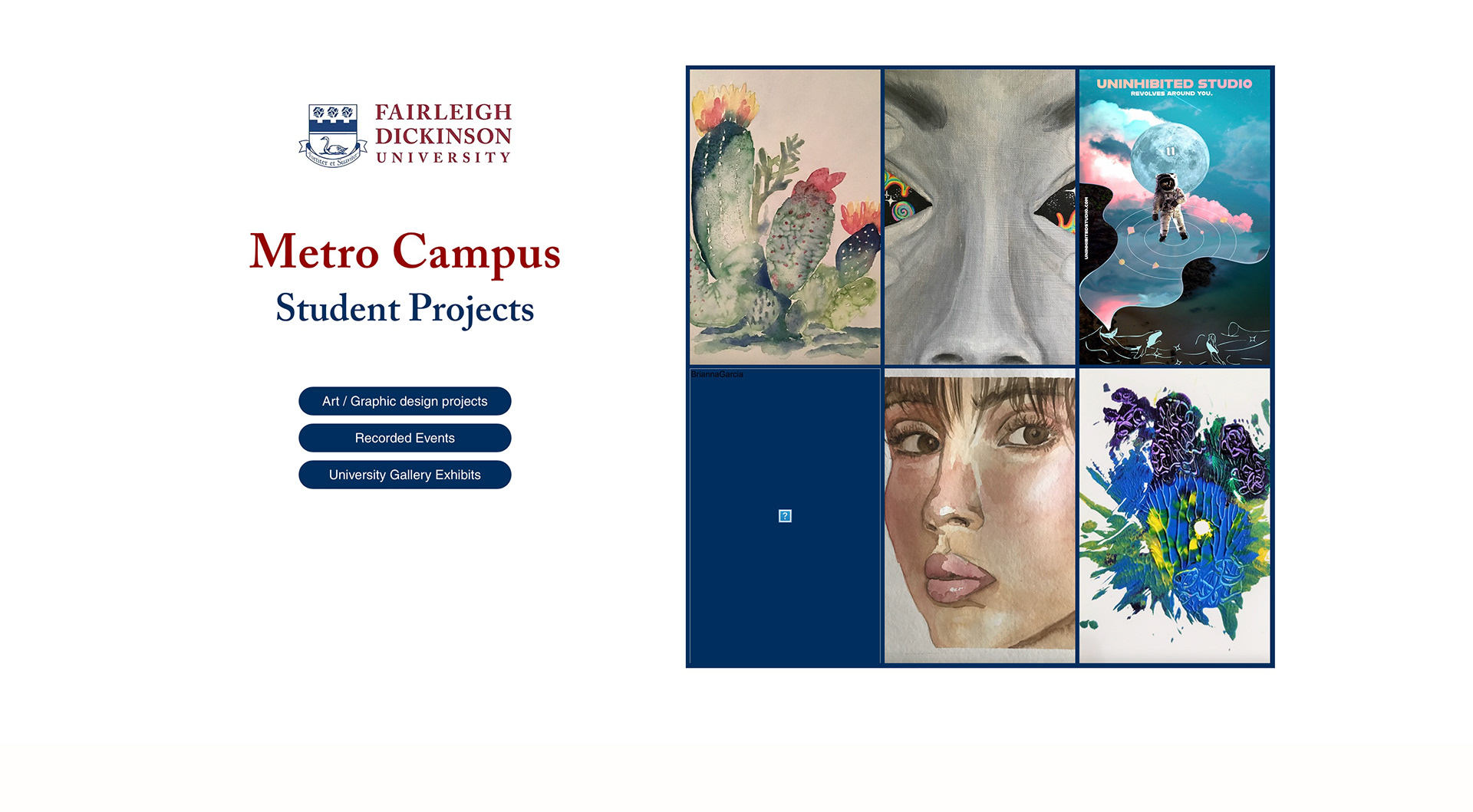
Home Page
The landing page introduces Metro Campus Student Projects with a clean, balanced layout. A curated grid of standout student artworks appears alongside primary calls to action, immediately engaging visitors and highlighting creative excellence. Clear navigation buttons direct users to Projects, Recorded Events, and Gallery Exhibits.
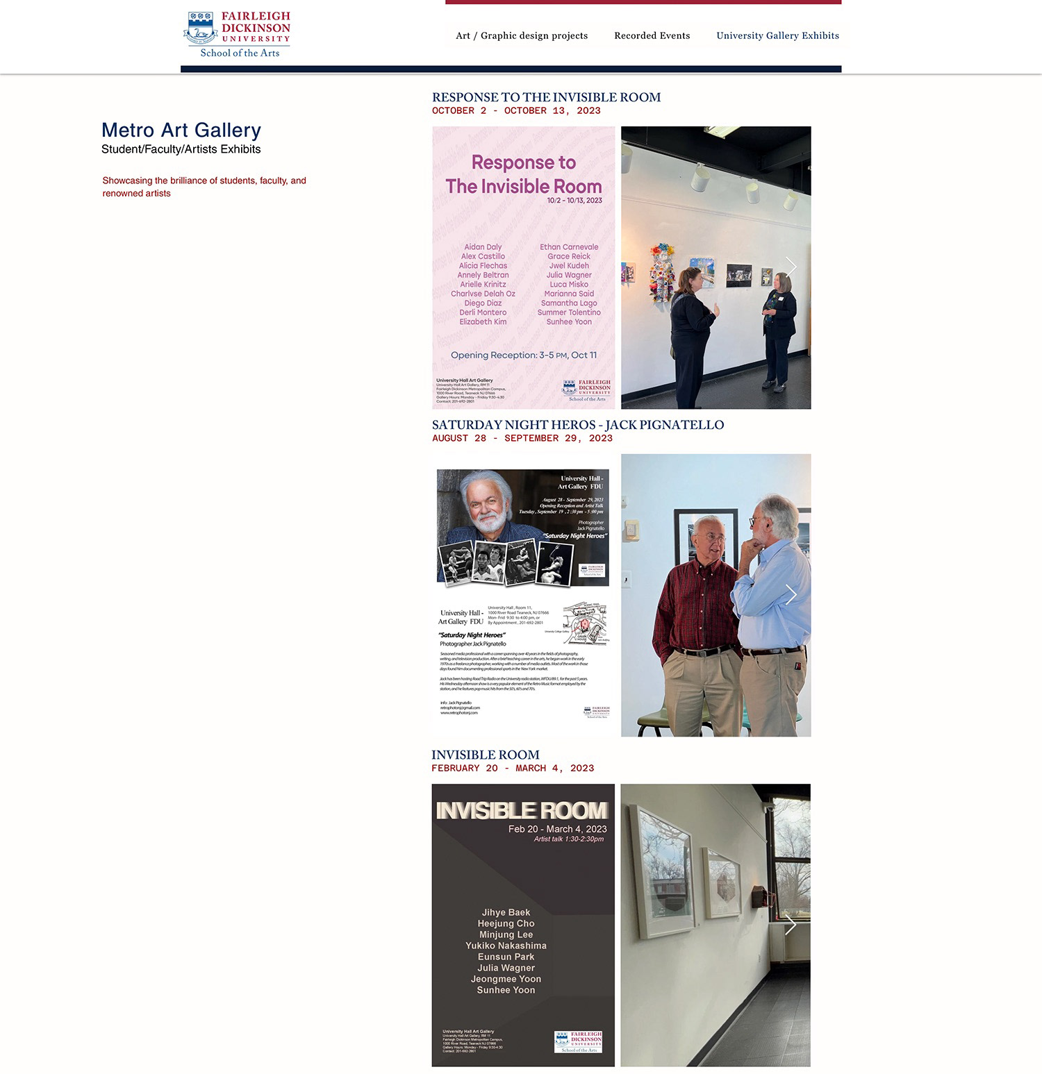
University Gallery Exhibits Page
The exhibits page showcases posters and installation photography from recent shows. An interactive viewing feature allows users to browse multiple images per exhibition. The layout serves as a visual record of student, faculty, and guest artist exhibitions, celebrating the campus art community.
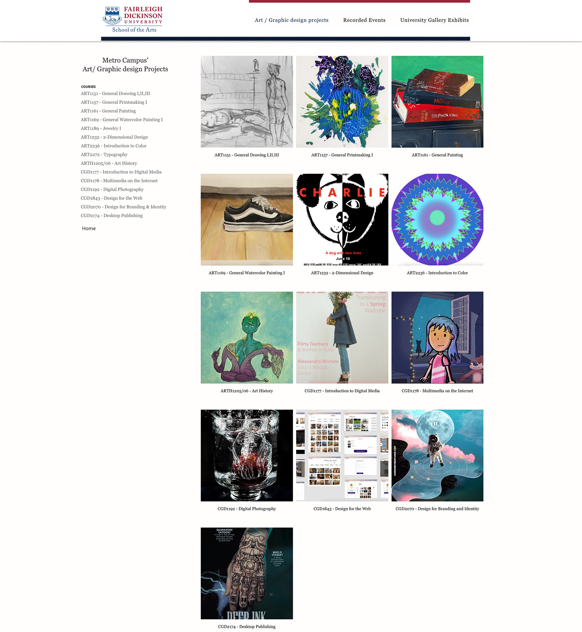
Art / Graphic Design Projects Page
This page organizes courses in a structured grid, pairing each subject with representative student work. A left sidebar lists all courses, enabling quick filtering and seamless exploration. The layout emphasizes clarity, variety, and the breadth of the curriculum.
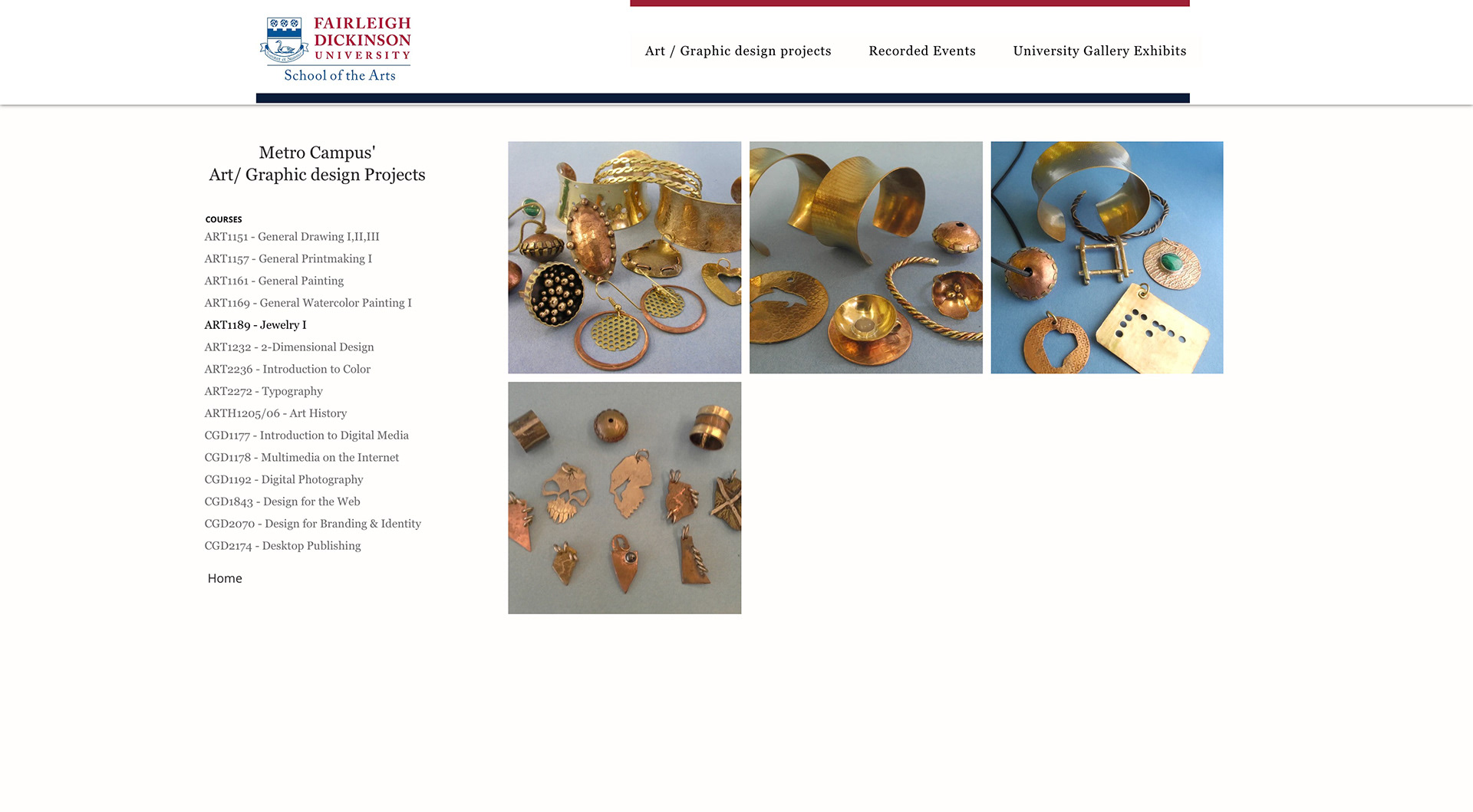
Individual Course Page (ART1189 Jewelry I)
The course page presents detailed images of handcrafted jewelry, focusing on material, texture, and craftsmanship. The persistent sidebar allows effortless movement between courses. The design highlights technical development and creative experimentation within the program.
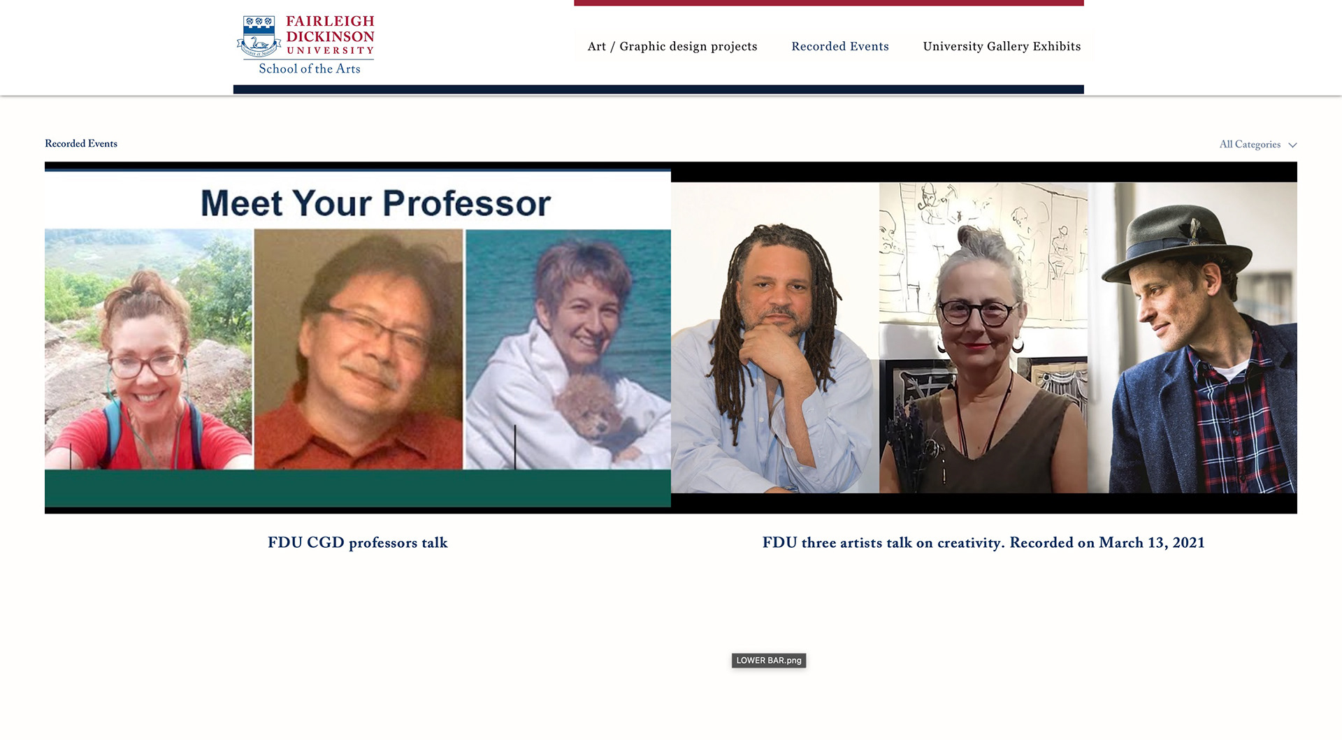
Recorded Events Page
This section integrates embedded video content to create an interactive experience. Featured talks such as faculty discussions and artist lectures are presented in a clean multimedia layout. The page functions as a digital archive of academic dialogue and creative exchange.
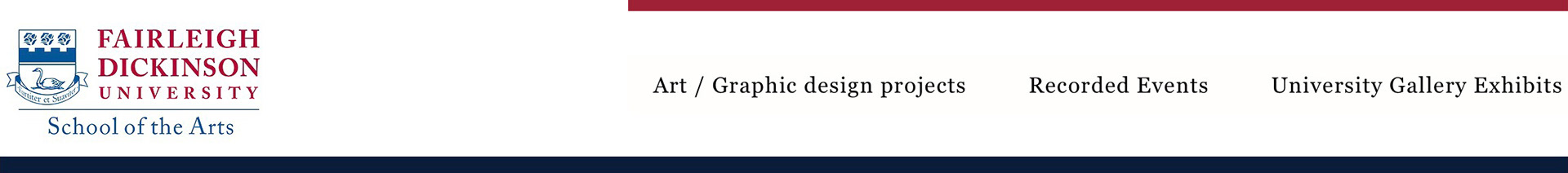
Header
The header prominently features the Fairleigh Dickinson University identity, reinforcing credibility and brand consistency. Signature university colors are integrated through structured bars, creating visual continuity. Streamlined navigation ensures intuitive access to core sections without overwhelming the interface.